Feedback that finds you.
Labels, hints, and errors that stay with the field.
Familiar components.
Thoughtful defaults.
Source you own.
'use client';
import { useState } from 'react';
import { Button } from './components/antiflex/button';
import { TextField } from './components/antiflex/text-field';

export function ProjectForm() {
  const [message, setMessage] = useState('');
  const [error, setError] = useState('');

  return (
    <form noValidate onSubmit={(event) => {
      event.preventDefault();
      const field = event.currentTarget.elements
        .namedItem('project') as HTMLInputElement;
      const name = field.value.trim();
      setError(name ? '' : 'Enter a project name.');
      setMessage(name ? `Sample project “${name}” created.` : '');
      if (!name) field.focus();
    }}>
      <TextField label="Project name" name="project"
        placeholder="e.g. Customer portal"
        description="A name your team will recognize."
        required error={error} />
      <Button type="submit">Create project</Button>
      <p role="status">{message}</p>
    </form>
  );
}Useful on the first click.
Considered all the way through.
Labels, hints, and errors that stay with the field.
A search, a few keys, and you’re there.
Search, use the arrow keys, then press Enter.
A familiar calendar. Your next milestone.
| Sun | Mon | Tue | Wed | Thu | Fri | Sat |
|---|---|---|---|---|---|---|
Arrow keys move days. Page Up/Down changes month.
Choose, clear, or change your sample date.
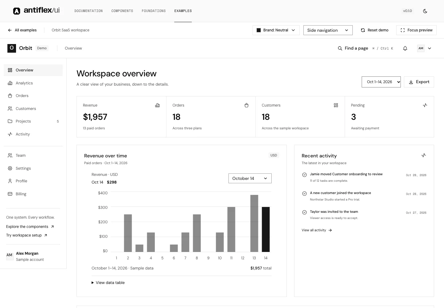
Meet Orbit. A connected SaaS workspace
built from the same foundation.
26 color palettes. 13 type sizes.
One shared language for design and code.
var(--af-palette-blue-500)Select a shade to copy its CSS variable.From the first label to the final detail. A readable foundation for the work your interface needs to do.
Explore typography--af-semantic-surface
--af-semantic-foreground
--af-semantic-actionDesign decisions,
shared by name.
Everything in its right place.
This preview changes locally. Your site theme stays yours.
Inspect the decisions.
Take the source. Keep building.
surfaceLight / DarkforegroundLight / DarkactionLight / DarkNamed variables, component variants, and shared typography in Figma.
Open Figma foundationsComponents / BadgeLight · Dark · States · Accessibility308 stories to inspect, with controls and accessibility checks.
Explore Storybookimport { Button }
from './components/antiflex/button';Original components. Editable source. A foundation that stays in your hands.
Browse the sourceBring a React app. We’ll bring the building blocks.
npx antiflex-ui@0.1.0-alpha.2 init --css src/index.cssReact 19 · Tailwind CSS 4 · Node.js 22.18+
Current installer: 0.1.0-alpha.2. APIs may change before 1.0.